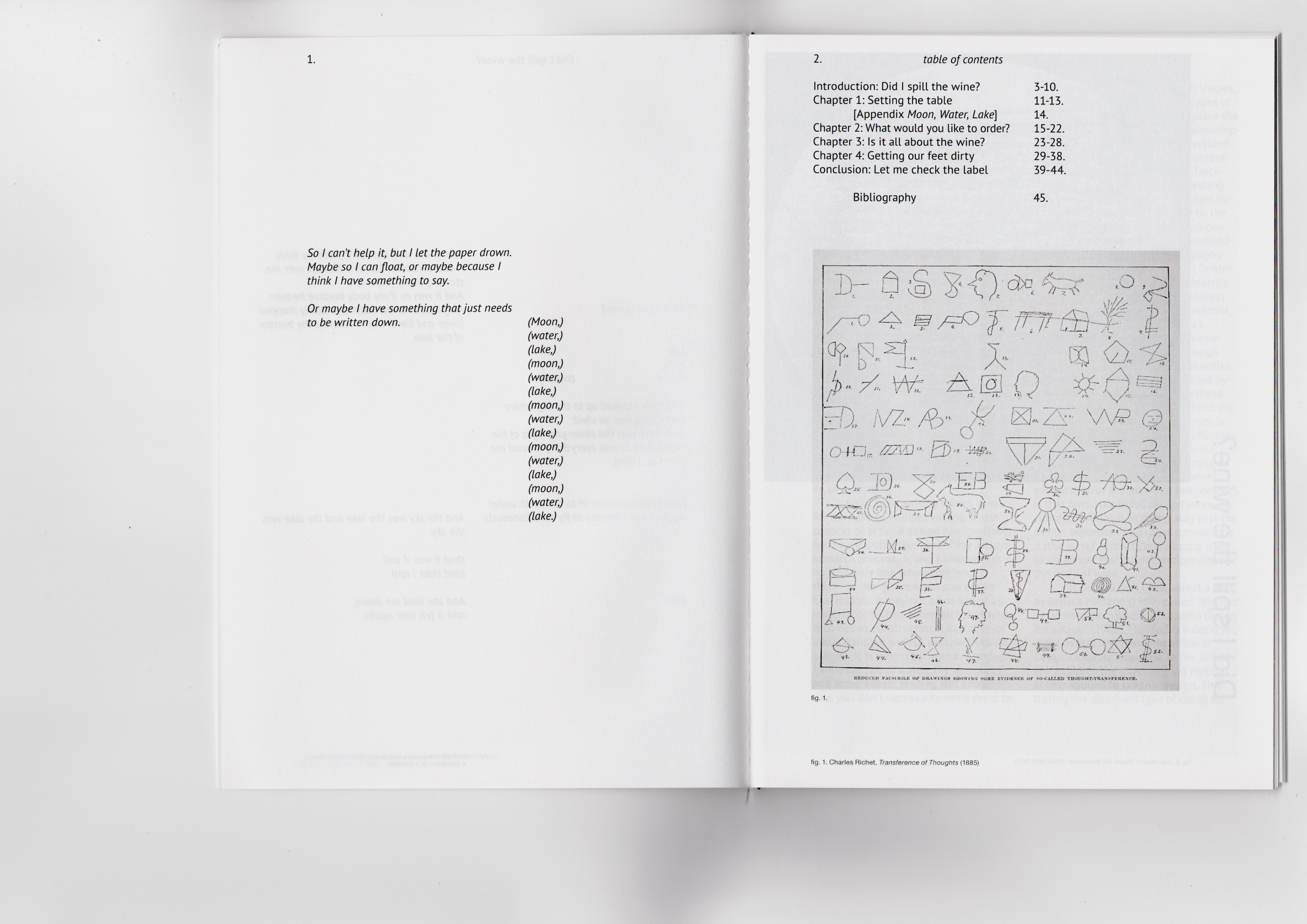
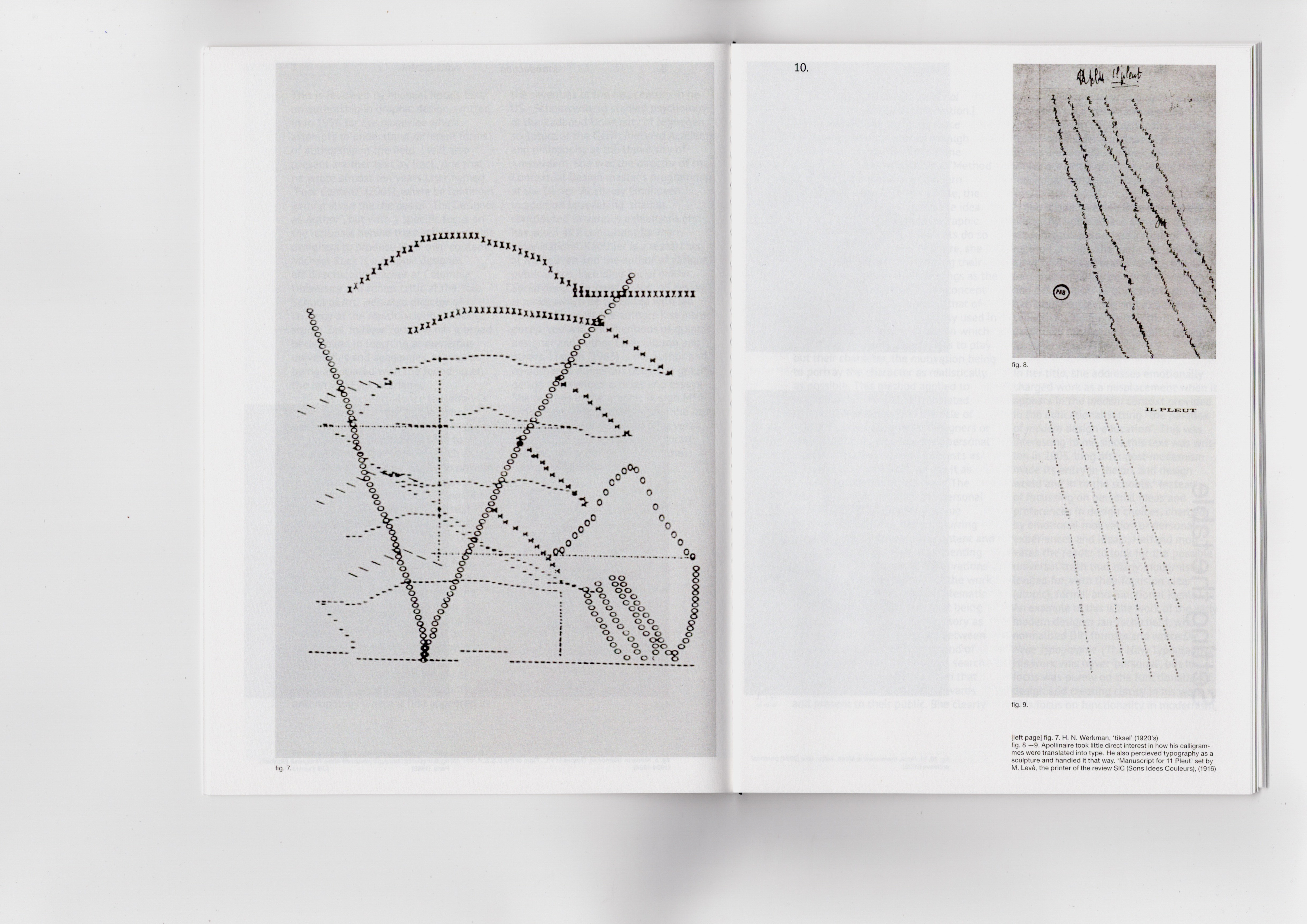
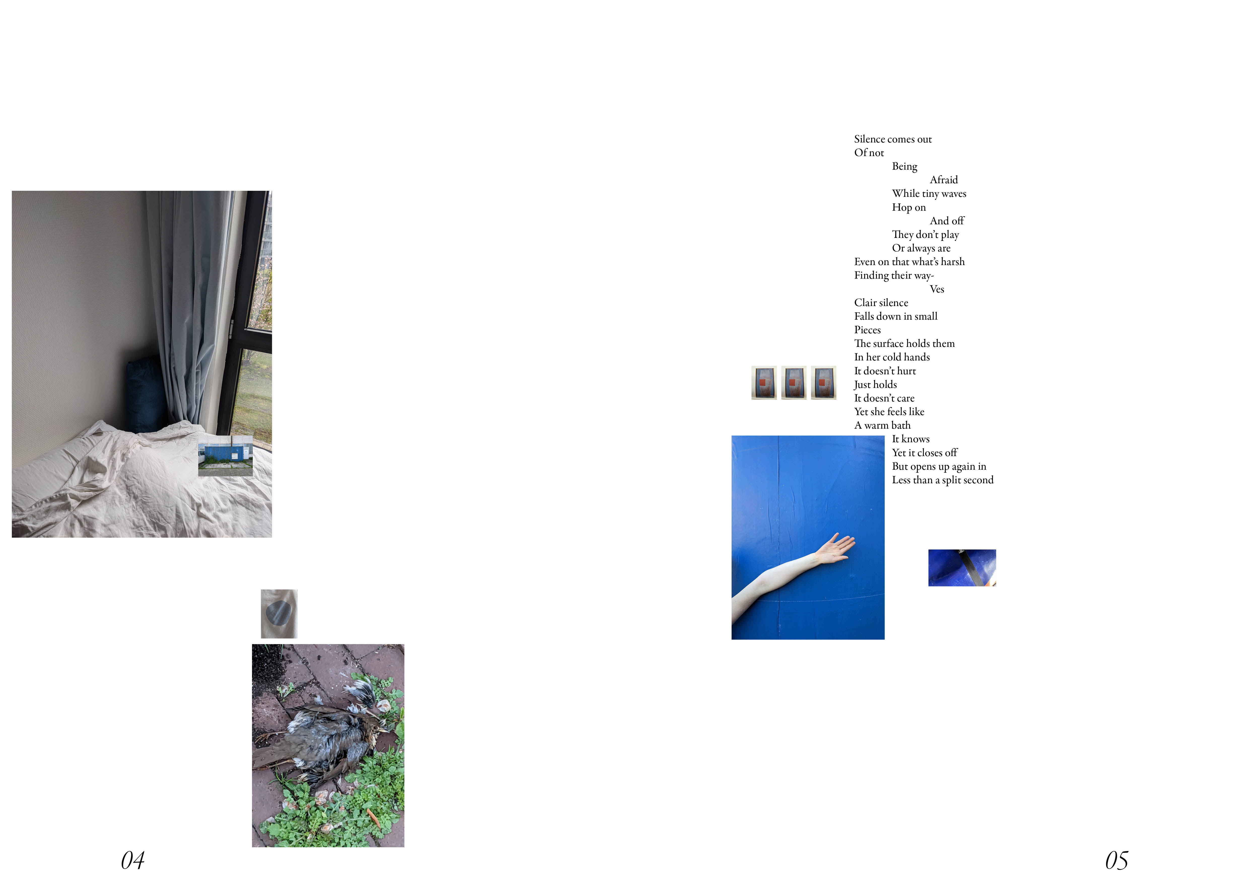
( Did I spill the wine? (2024) )
Essay, publication
![]()
![]()
![]()
![]()
![]()
![]()
![]()
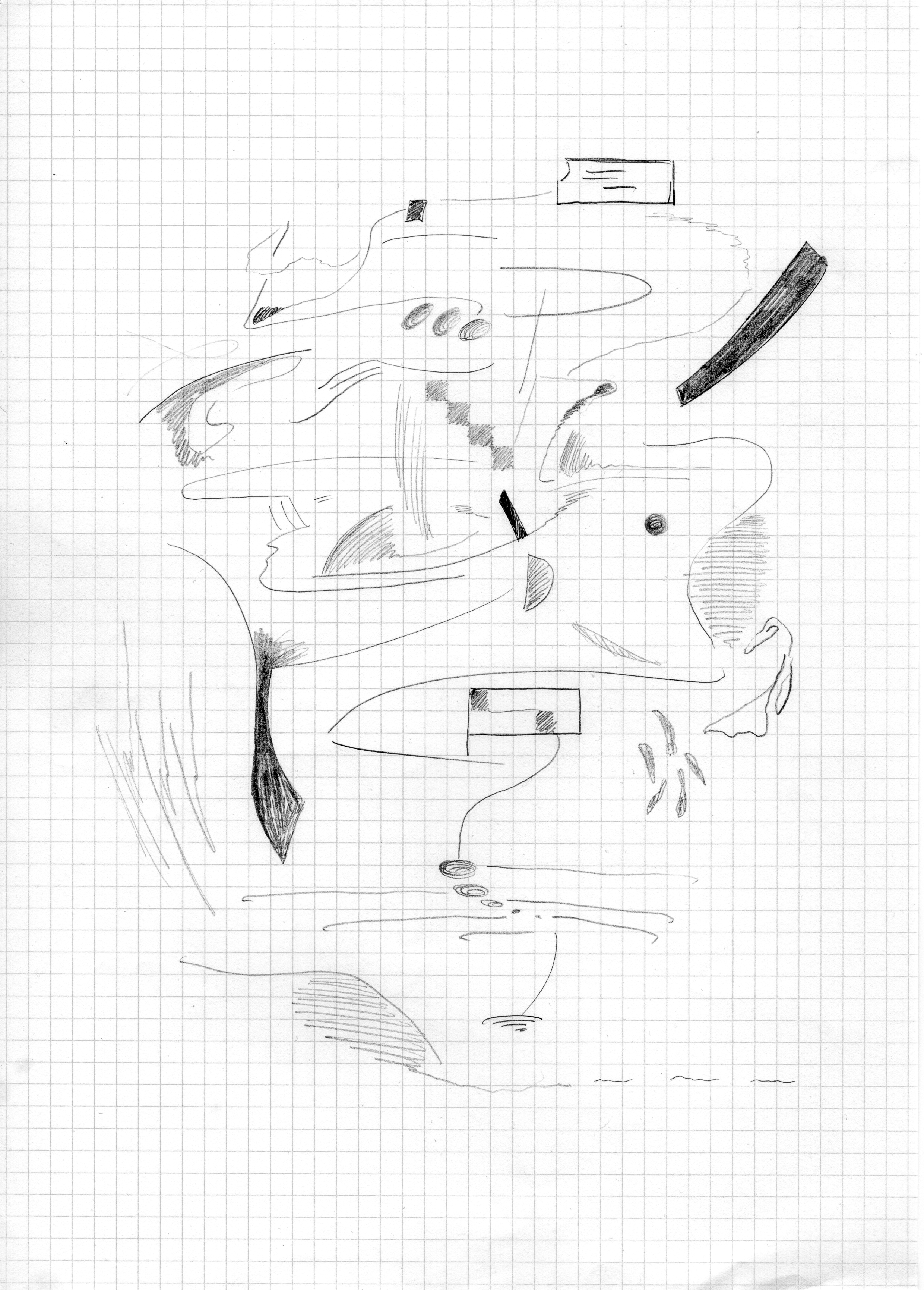
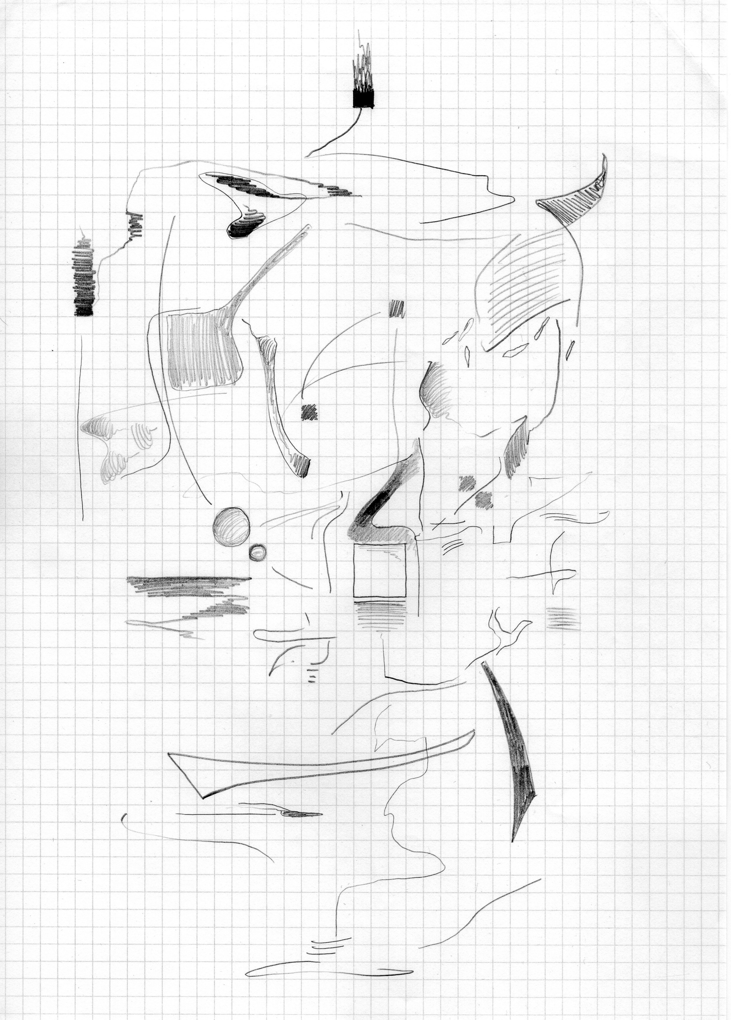
( Moon, water, lake (2024) )
The dissection of a memory
publication
Appendix to Did I Spill the Wine?
Poetic translation of an experience through experimental writing and psychoanalyses.Essay, publication
An attempt to understand the role of the graphic designer as an ‘author’.
Reflecting on motives,ideology, politics and personal preference.
Reflecting on motives,ideology, politics and personal preference.


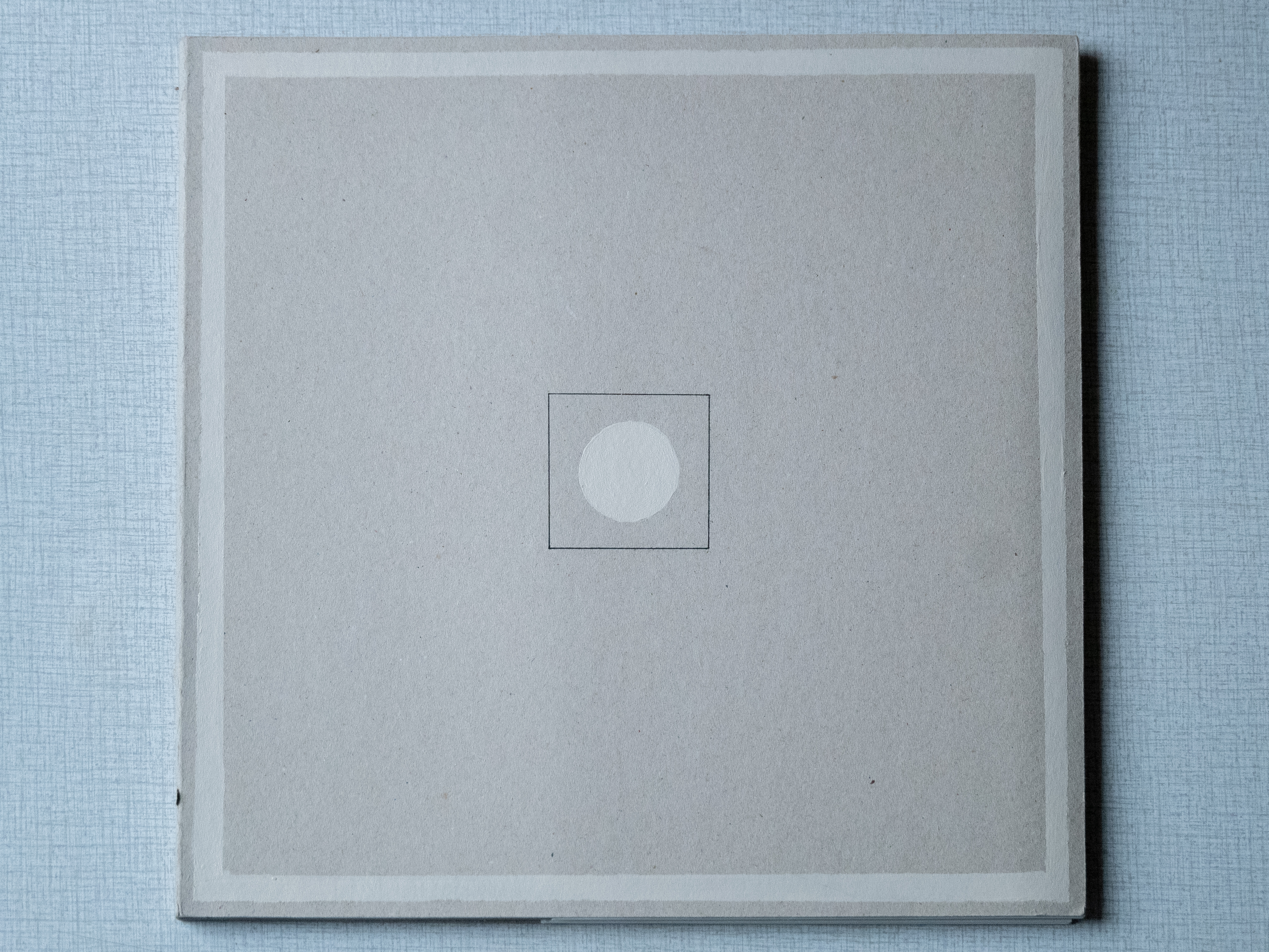
Did I spill the wine?; 2024
Laserprint (b&w), sewn with black yarn
Interior: Biotop 80 gr/m2
exterior: Biotop 250 gr/m23
![]()
.
Laserprint (b&w), sewn with black yarn
Interior: Biotop 80 gr/m2
exterior: Biotop 250 gr/m23

.
( Moon, water, lake (2024) )
The dissection of a memory
publication
Appendix to Did I Spill the Wine?

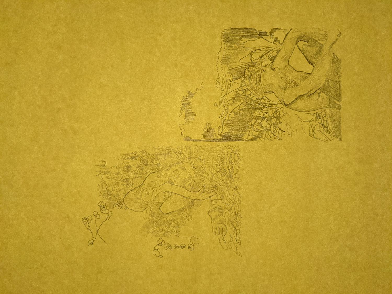
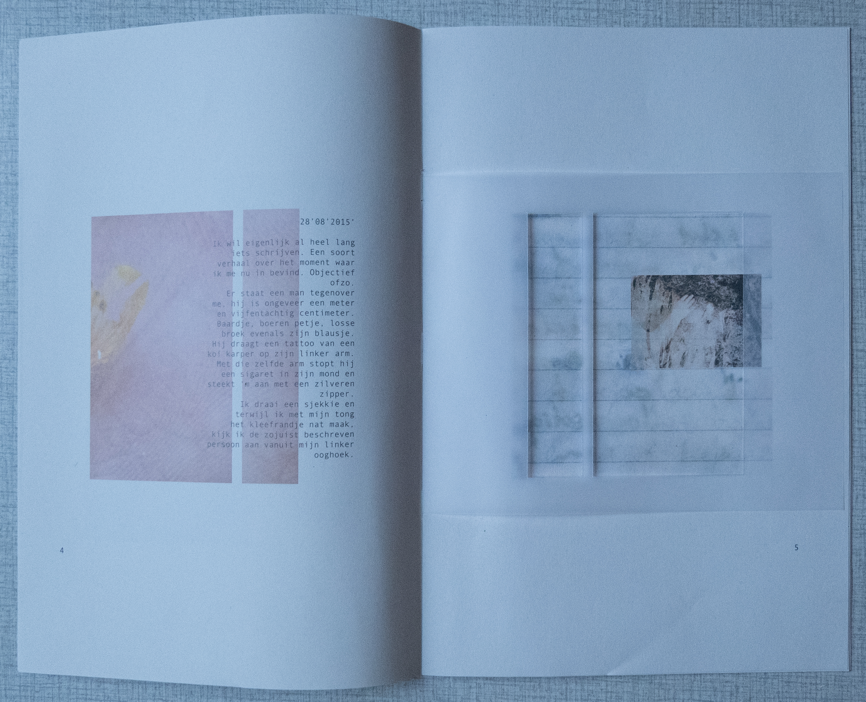
Moon, Water, Lake; 2024
Laserprint (b&w, true sto size), sewn with black yarn
Interior and exterior: Biotop 80 gr/m2
originally handwritten with a Parker pen in blue, extra thin and a Pentel Japan pencil in 0,5 mm on moleskine paper (with grid)
Laserprint (b&w, true sto size), sewn with black yarn
Interior and exterior: Biotop 80 gr/m2
originally handwritten with a Parker pen in blue, extra thin and a Pentel Japan pencil in 0,5 mm on moleskine paper (with grid)
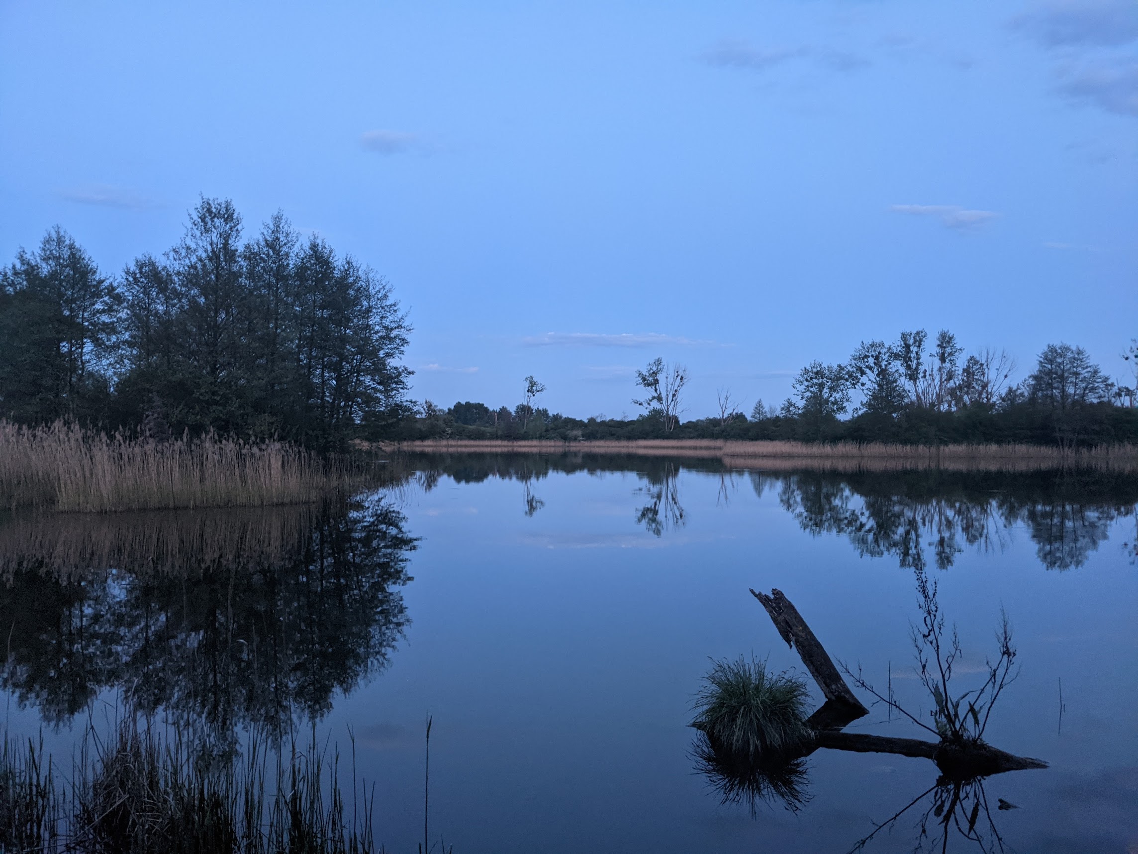
(2) Jezioro Wądół, PL
digital image; 2023
digital image; 2023


.
( Origins (2025) )
Clay tablet / installation
An investigation in to the origins of print: I have a fascination for ancient clay tablets and their designs. During the course “Organic Sculpture” there was room to explore a diverse range of natural materials and their meaning; borowing knowledge from alchemy, a subject that has caught my attention since my early teens. In this particular project my aim was to bring together elements form graphic design, sculpture and a hint of alchemical theory. ![]()

first stage
Clay, bronze
Clay, bronze


Origins; 2025
Clay, copper, bronze, coal
140 x 50 x 35 cm

process
Clay, collected material
Clay, collected material

first stage (2025)
Clay, bronze
.
Clay, bronze
.
( Re-writing Home (2024) )
Bachelor Thesis


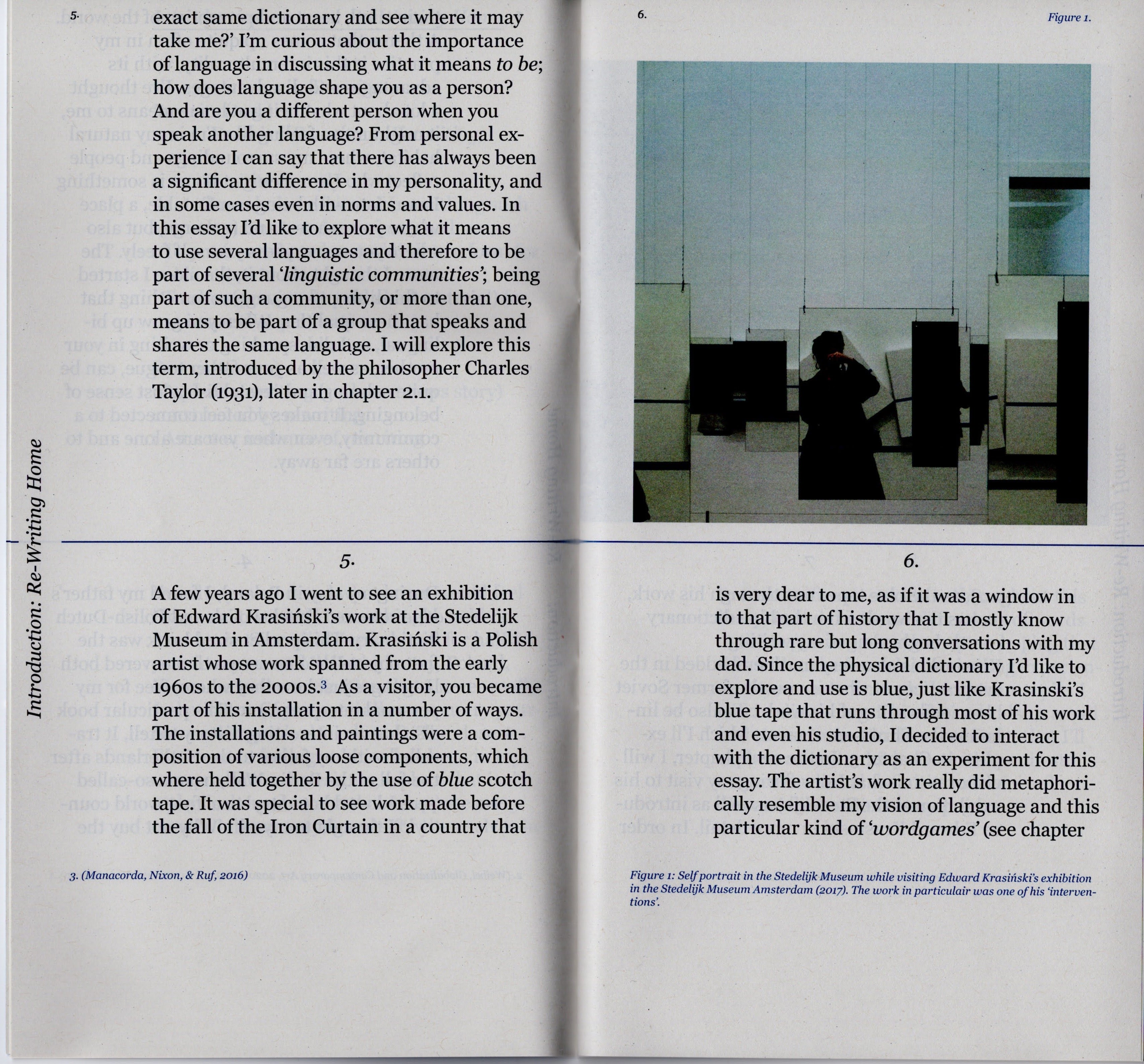
Re-writing Home (2024)
publication, visual essay
145 x 365 mm
exterior: recystar 120 gr/m2
interior: recystar 60 gr/m2
Stapled
set in Georgia
![]()
publication, visual essay
145 x 365 mm
exterior: recystar 120 gr/m2
interior: recystar 60 gr/m2
Stapled
set in Georgia

ways of interaction

Patrząc przesz okno— 698. / 699.
( About )
Hello, I’m Esmée Jakubowski (NL 1997), a Dutch- Polish graphic designer based in the Netherlands.
Having two cultural backgrounds left me curious on how various (and at times contradictory) interpretations of reality, truth and values come to form. By assembling visual research and written material, I translate multiple ways of percieving an always changing perspective.
.
Publications
“Did I spill the wine?”
Publication (visual essay) 2024. An attempt to understand the role of the graphic designer as an ‘author’. A reflection on motives, ideology, politics and personal preference.
“Moon, Water, Lake”
Publication, 2024 -the dissection of a memory-
‘In the Netherlands, 4 contemporary art museums go beyond the old masters’ Washington Post (photography)
“A Supermarket of Lost Bodies”
I wrote the introduction with Ben Howell and contributed a personal project in “À Corps Perdu”
A publication by the HKU Graphic Design department year 3 (2022)
Parts of the jury raport in “Conversation Snippets”
Publisher St. Best Verzorgde Boeken (2021)
“The quit place in our blind spot” in ABRI-Magazine
Photography, poster, essay (2020), as well as being part of the editorial team.
Contact:
esmeejakubowski@gmail.com
Download my cv in English or Dutch
Exhibitions:
Did I spill the wine? Lorum Ipsum, Amsterdam 2024
Did I spill the wine? Exposure HKU, Utrecht 2024
Yesterday Today Stedelijk Museum Amsterdam, 2022 - now (During an internship at the Stedelijk Museum Amsterdam I took part in curating and designing the exhibition)
Collaborations:
Student jury panel (2020/2021)
Best Verzorgde Boeken
Co-founder, initiator (2020)
Ginkgo-Collective in partnership with Kunst Onderzoek (Lectoraat HKU)
Editorial Team (2020)
ABRI-Magazine (HKU)
( Visual/ material research, reflection (2024/25) )
various media


Design and mold; 2024/ 2025
form research
form research


Zine; 2025
visual reflection on a drawing (2023)
paper, pen, pencil print, acrylycs, yarn
![]()
visual reflection on a drawing (2023)
paper, pen, pencil print, acrylycs, yarn

Notes 2024 - 2025

Sketch 2024
.
.
( A Proposal (2019) )
Poster zine / collage of text and visual language


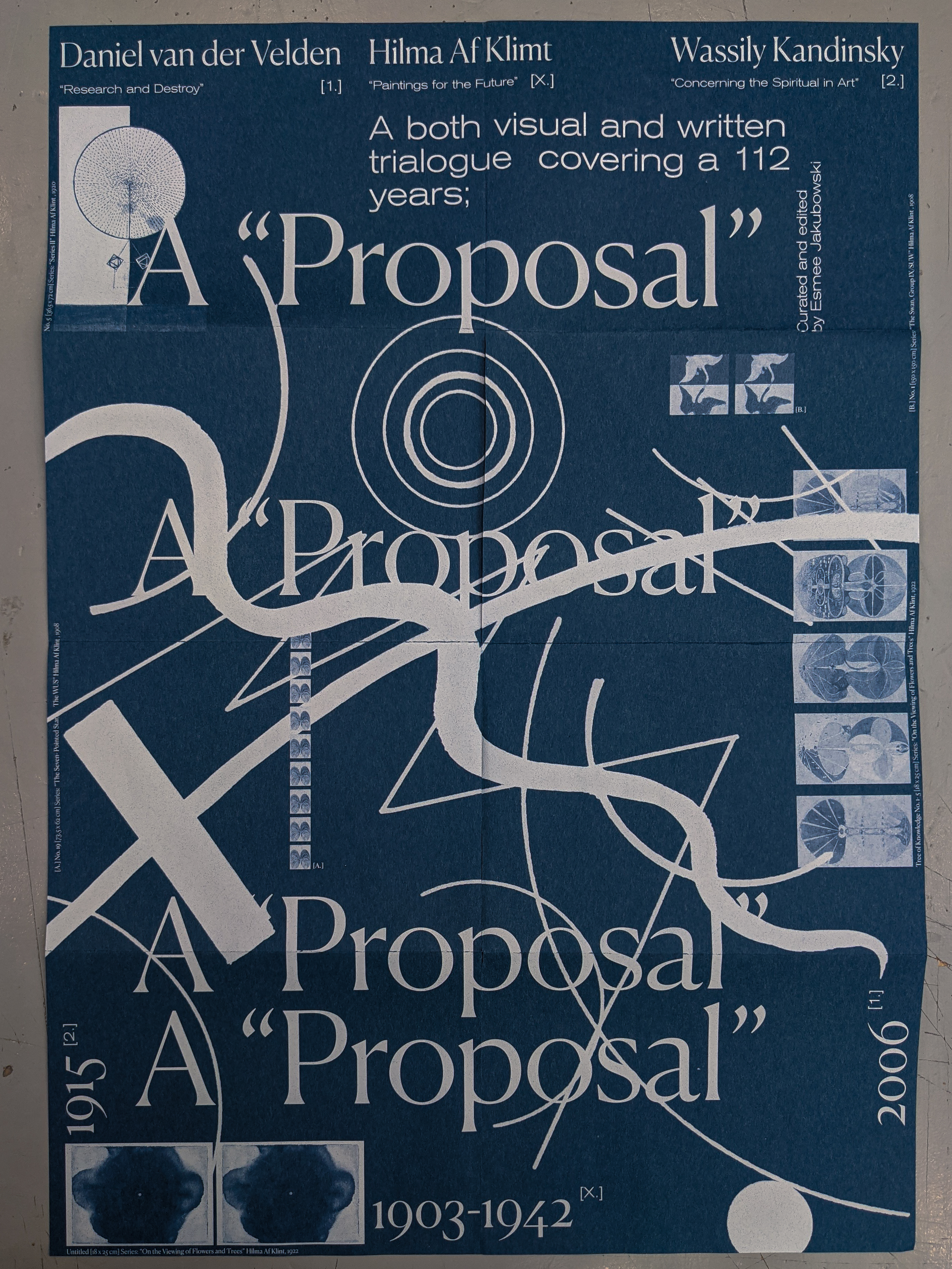
A Proposal; 2019
Poster zine
Folded: 150 x 210 mm,
unfolded: 420 x 595 mm
UV print on Satogami 90g/m2 in blue
Untiteled; 2019
A small booklet to collect the research for this project
.A small booklet to collect the research for this project
( Perception (2023 - 2024) )
Drawings, paintings
Sketch 1/5; 2023
pencil on paper
pencil on paper
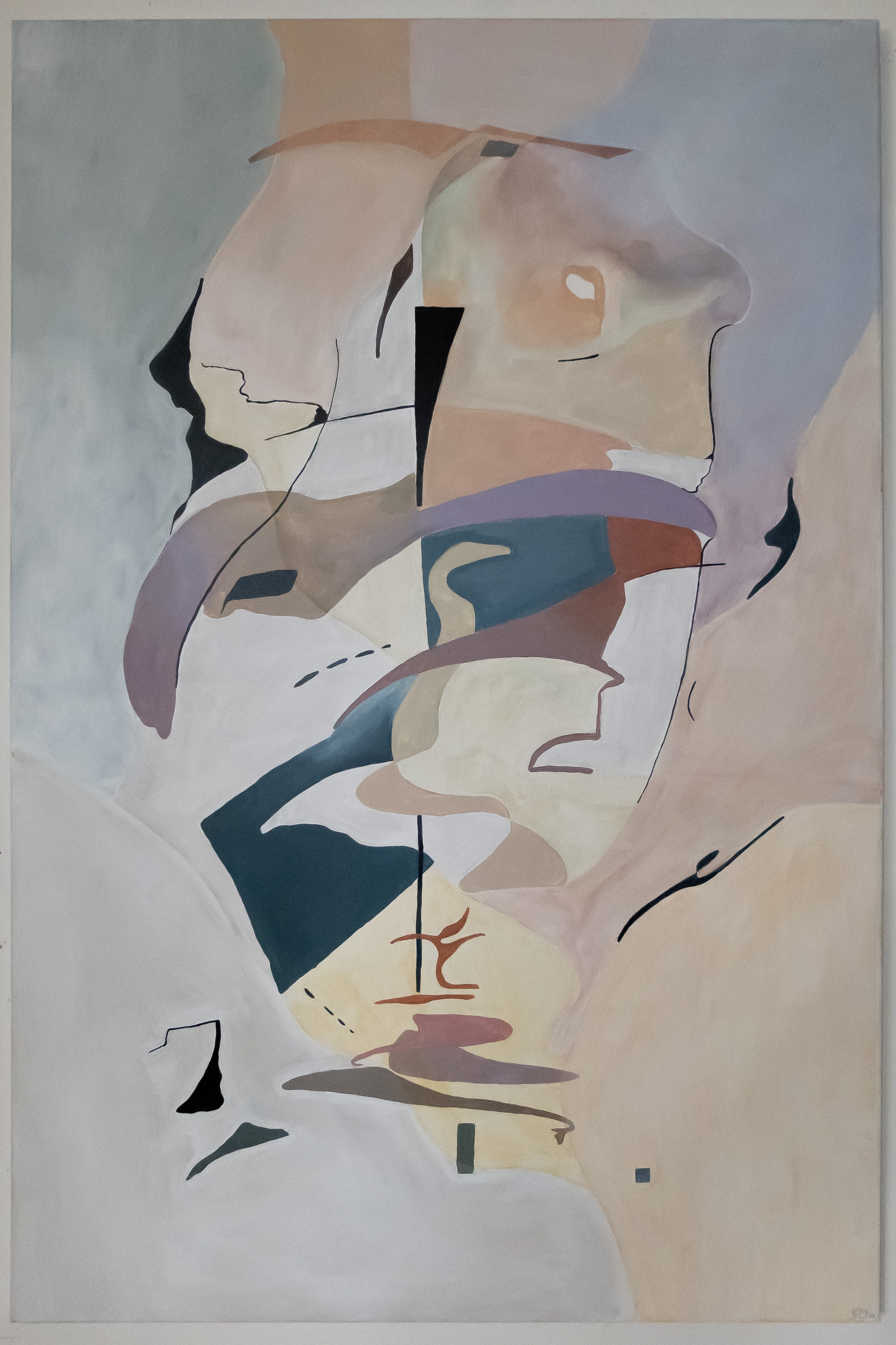

Perception; 2023 - 2024
Paintings (2/3), both 1400 x 770 mm, acryl on linen.

Sketches 1-5; 2023
pencil on paper
pencil on paper
.
( Writing )
“Did I spill the wine?”
Graduation project (BA graphic design)
Essay, publication
University of the Arts Utrecht
(2024)
“Re-writing Home”
Graduation thesis (BA graphic design)
University of the Arts Utrecht
(2024)
‘A Supermarket of Lost Bodies’
Introduction text to a publication (written in collaboration with Ben Howell)
A publication by the HKU graphic design department year 3 (2022)
“Conversation Snippets”
jury report (collaboration)
Publisher St. Best Verzorgde Boeken
(2021)
‘Ruimte in je hoofd’
Article (dutch)
at the request of stichting de Tolhuistuin Amsterdam
(2021)
by a lake (nearby Lipiany, Poland). 2022
.
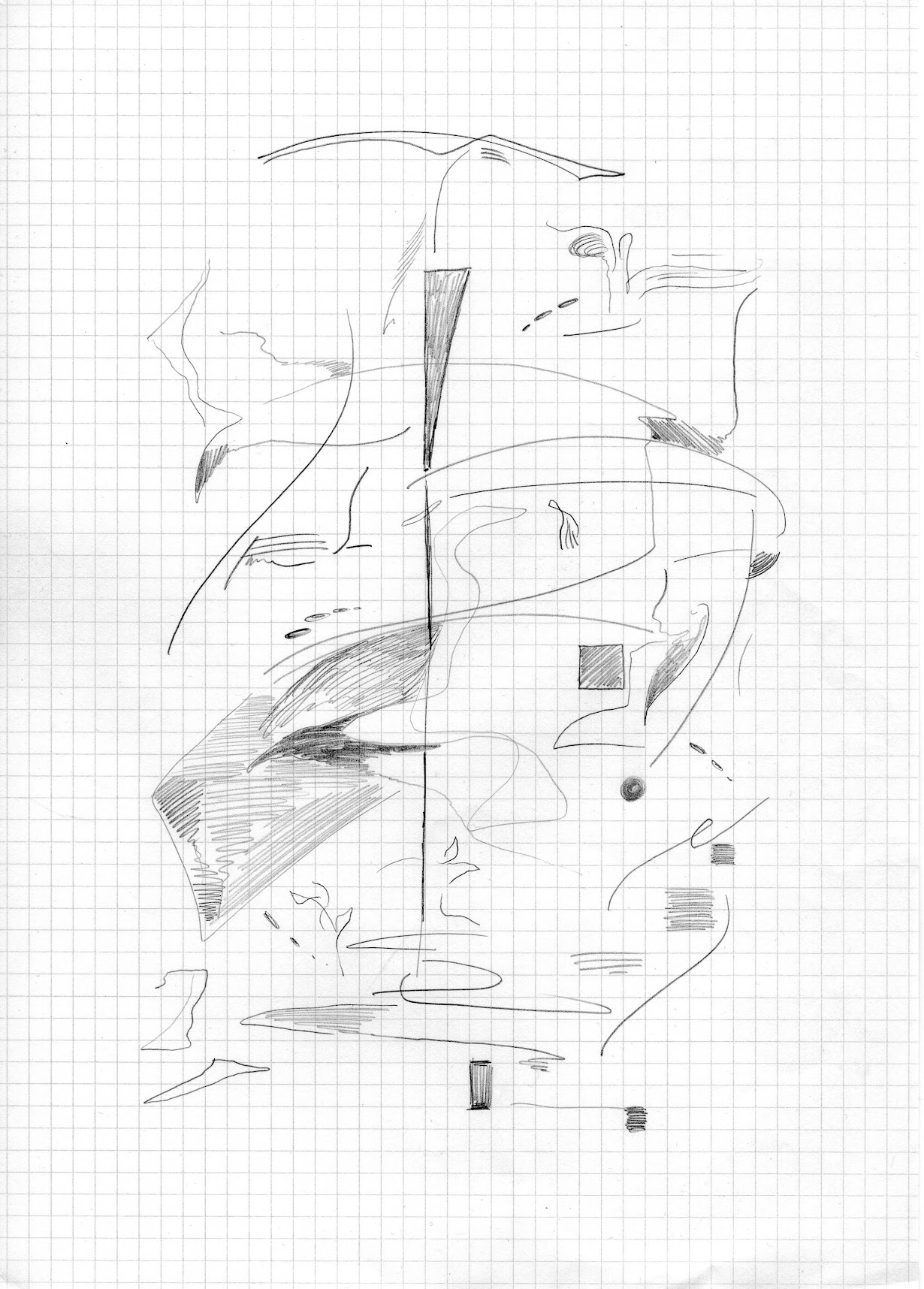
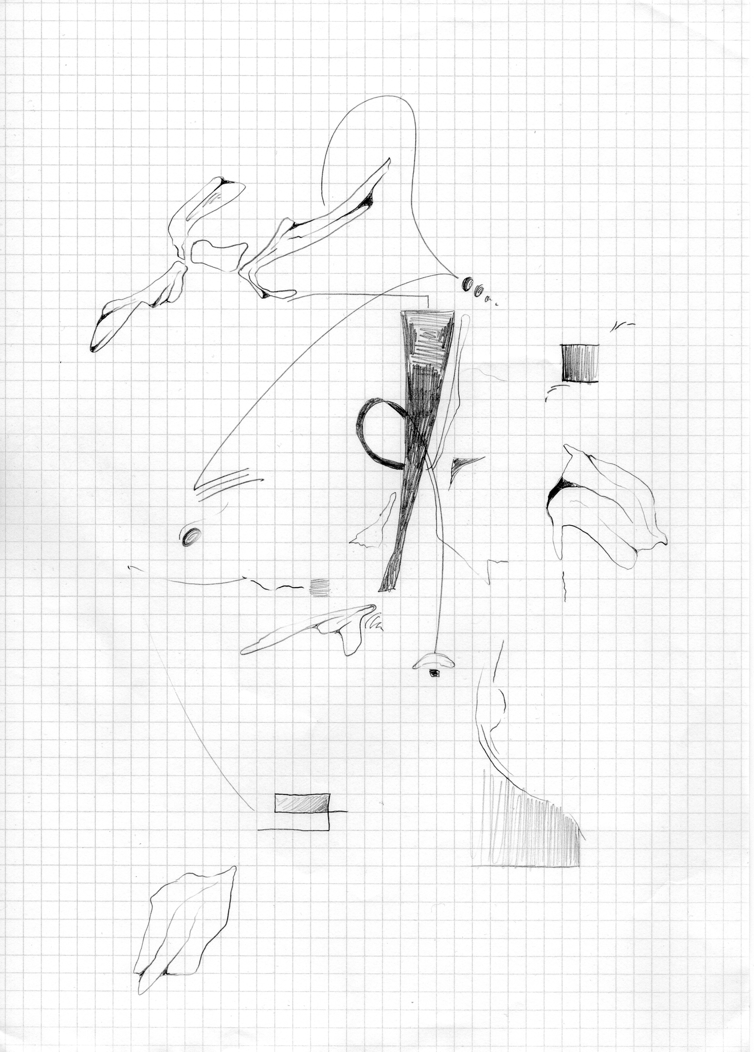
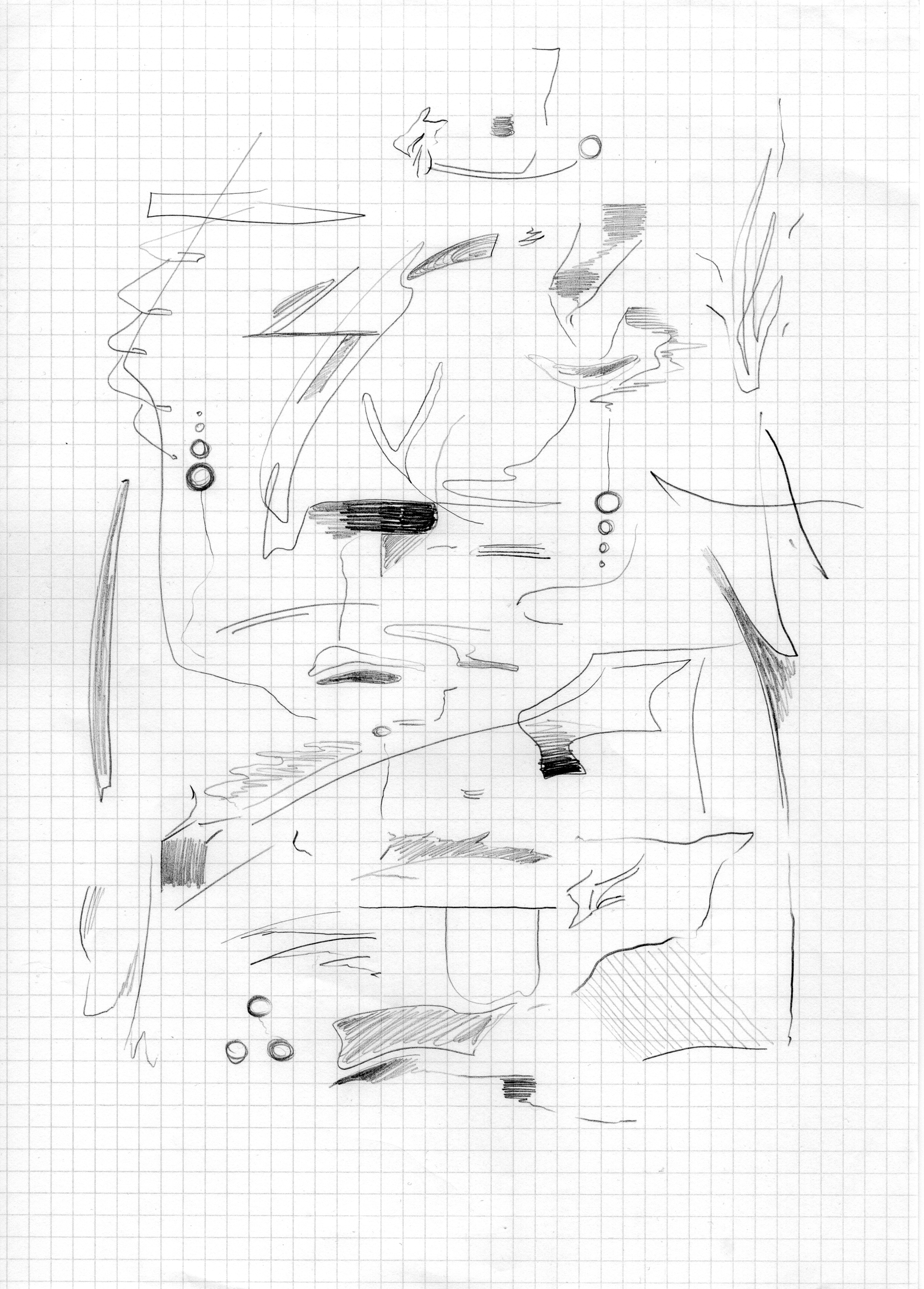
( Antonymes in blue (2021) )
Drawing
Visual [poetry]
When speaking of the blue
square as a (metaphysical) subject, the
term implicates that the blue square, that it indicates in this situation, is
an object that we can “know” and/ or it’s something we can “act” up on. The
essential characteristics of this subject are also called attributes. (Braeckman, Raymaekers,
& van Riel, 2010, p. 311) Something we have to
keep in mind, is that we can always find other ways to interact with the
subject; there’s two attributes of IKB 3 that a layman would
consider “as essential visual characteristics” to this painting. It’s blue (1) and a rectangle (2).
![]()
![]() .
. ![]()

 .
. 
Sketches 1/3; 2021
blue pencil on white paper
blue pencil on white paper
(Visual) poetry; 2021
photography, words
photography, words
Interactions with blue nr. 4; 2021
drawing, 420x 594 mm
White pencil on Gmund Matte medium, 90 gr/m2
.
( Tussen de woorden (2020) )
Publication
Publication
“Tussen de woorden” (Eng: “Between the words”) is a collection of various texts by artists, writers, or anyone who wrote something that caught my eye.
When editting the text, I used white space to create a new narrative within the existing one. Every story comes with a collage.


.
Editing, collecting, writing;
image selection, design
![]()
Tussen de woorden (2020)
Publication, collages, words
180 x 254 mm,
exterior: hard cover, rest material, UV print
Interior: Laser print, Recystar 160 g/m2
Binding: Swiss binding, sewn and cold glued
set in Canela
image selection, design
Tussen de woorden (2020)
Publication, collages, words
180 x 254 mm,
exterior: hard cover, rest material, UV print
Interior: Laser print, Recystar 160 g/m2
Binding: Swiss binding, sewn and cold glued
set in Canela
.
( A collection of friends (2020 - 2023) )
photography, collage, drawing
Over the course of three years I took pictures of the dogs I encountered on the streets, I drew a selection of them.photography, collage, drawing


Drawing
500 x 700mm
pencil on Satogami 90g/m2 in white
500 x 700mm
pencil on Satogami 90g/m2 in white

.
( Door Röring (2019) )
Publication
These days the KNSM island in the east of Amsterdam houses close to 2400 residents, and is seen by many as a serene place to live.
In the late 80’s the architect Jo Coenen was asked to design housing at this location after it was used as a harbour. His projects embraced the couple left over buildings from the KNSM-era, and refferd to the past while creating space for new things to emerge.

publication, archival research 297 x 210 mm
ex/in- terior: Papyrus 120g/m2
Laser print, riso
Binding: black elastic
.
Together with four classmates, and two students Cultural Anthropology, we’ve started Ginkgo Collective in the beginning of 2020.
I was responsible for the concept-development and research, buisness strategy and copywriting. Together with the whole team we’ve created content such as podcasts, interviews and collages.
Team:
Anke Verbeek
Juul van der Zandt
Valentino Angela
Annemijn Catshoek
Esmee Jakubowski
In partnership with KunstOnderzoek
Instagram
Our mission and vision:
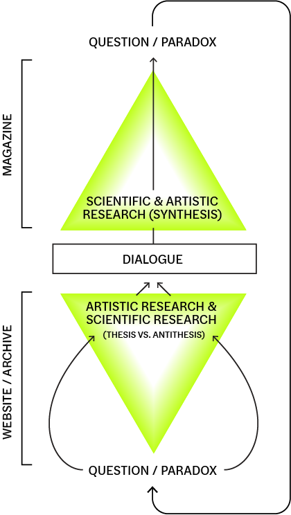
Ginkgo is a place for dialogue between (aspiring) scientists and artists to explore their meaning of research through dialogue: we are looking for people to explore an open language with us!
Ginkgo offers a platform where dialogues can take place, a space where you can find and add references coming from your own discipline and a place for asking questions when you don’t know where to start looking for an answer. For the moment our platform is still online, but in the future we’d like to create a magazine that continues the online conversation and gives designers, artists, scientists, and writers the opportunity to publish their common thoughts: Our fuel is curiosity!
Anke Verbeek
Juul van der Zandt
Valentino Angela
Annemijn Catshoek
Esmee Jakubowski
In partnership with KunstOnderzoek
Our mission and vision:
Ginkgo is a place for dialogue between (aspiring) scientists and artists to explore their meaning of research through dialogue: we are looking for people to explore an open language with us!
Ginkgo offers a platform where dialogues can take place, a space where you can find and add references coming from your own discipline and a place for asking questions when you don’t know where to start looking for an answer. For the moment our platform is still online, but in the future we’d like to create a magazine that continues the online conversation and gives designers, artists, scientists, and writers the opportunity to publish their common thoughts: Our fuel is curiosity!
Who we are:
Ginkgo’s core consists of seven aspiring professionals in graphic design and cultural anthropology and development sociology: through some philosophy, trust, a big interest in interdisciplinarity and an open mind we try to bring people together. We are continuously refining and building our platform with the ideas and expertise of professionals such as professors, artists, designers, but most importantly students themselves. We believe that art and science might be seen as parallels and that meeting in the middle is seen as something quite impossible. However, we believe putting the two together could lead to new approaches of research, perceptions, collaborations, discussions and resources.
As students, mistakes can be made without any big consequences. So look at Ginkgo as if it were a playground. Here you can play with things you cannot find in your own discipline, but yet seek feedback and help from other students and experts from different fields of knowledge and translate this to your personal practice.
Our aim is to find the synthesis we call Ginkgo: approaching knowledge that’s not goal directed, neither exploratory based, but just takes the good stuff from science and art in all its forms while it still respects the core identity of each discipline and each person.
What do we stand for?
As a platform, we value trust, open mindedness, acknowledgment, adequate sources of information, your values as a person and as a professional, transparency, constructive feedback, understanding and honesty: a safe space where mistakes can be made.
As a part of our community we ask you to stay open minded, try to look at structures of thinking beyond your own and give attention to the way such structures are created. We encourage members to trust this open space and to engage in new learning possibilities by meeting new people and ideas.
Stay true to yourself and your profession while enjoying a conversation with someone that has an opposite approach: Welcome to a place behind the parallel where we’d like to meet on an open ground.


.
( Tolhuistuin - Sunday Sounds (2019) )
Identity
Identity
For the identity of this event I took photographs of the plants and flowers from the Tolhuis “tuin” (garden). When making this poster i’ve focussed on rythm, contrast and a natural looking finish which I achieved by using riso print
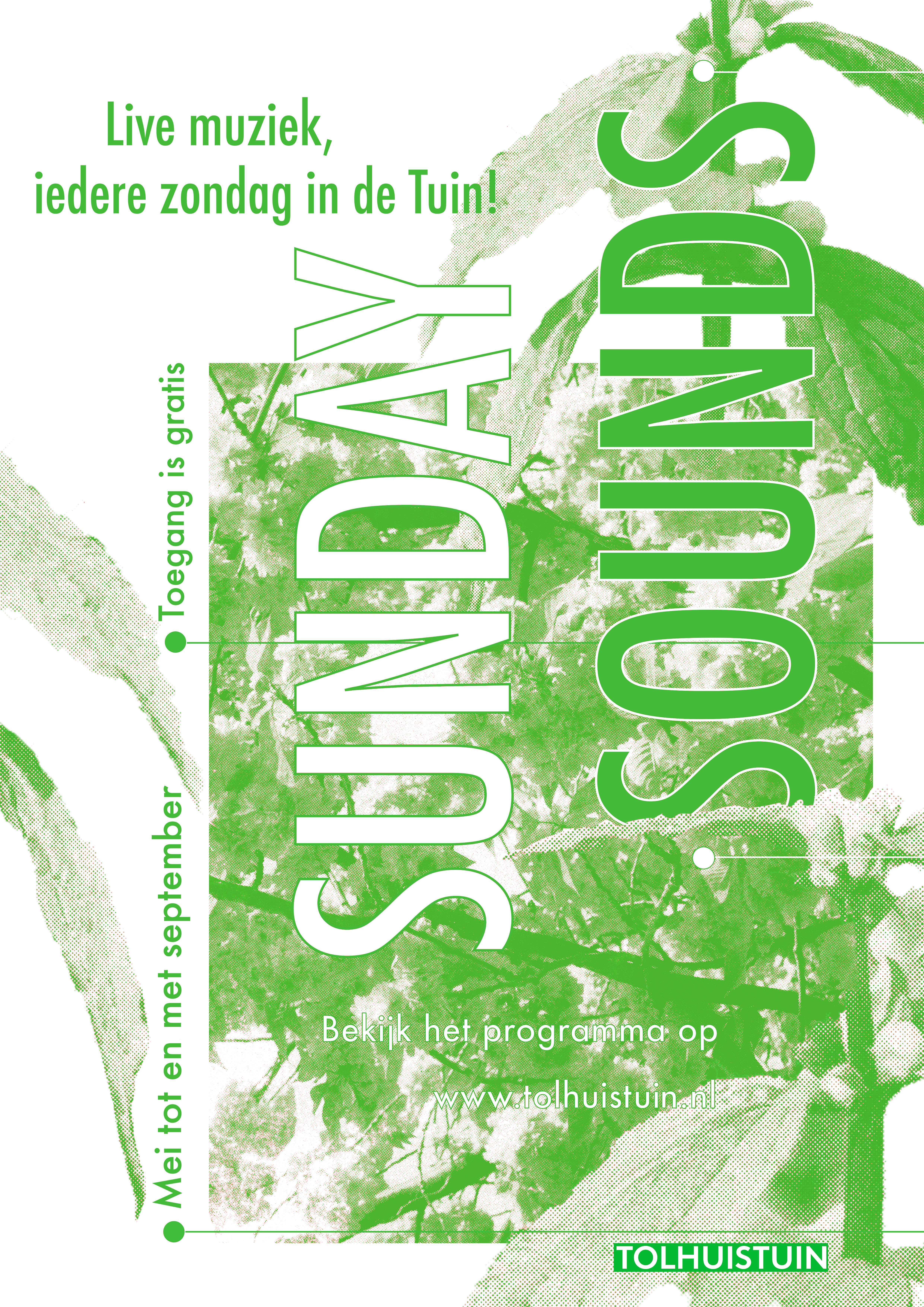
Tolhuistuin - Sunday Sounds; 2019
297 x 420
mm
Riso, collage, photography, typography
Riso, collage, photography, typography
.
( Throwing a dice on a mirror (2019) )
Publication
Publication
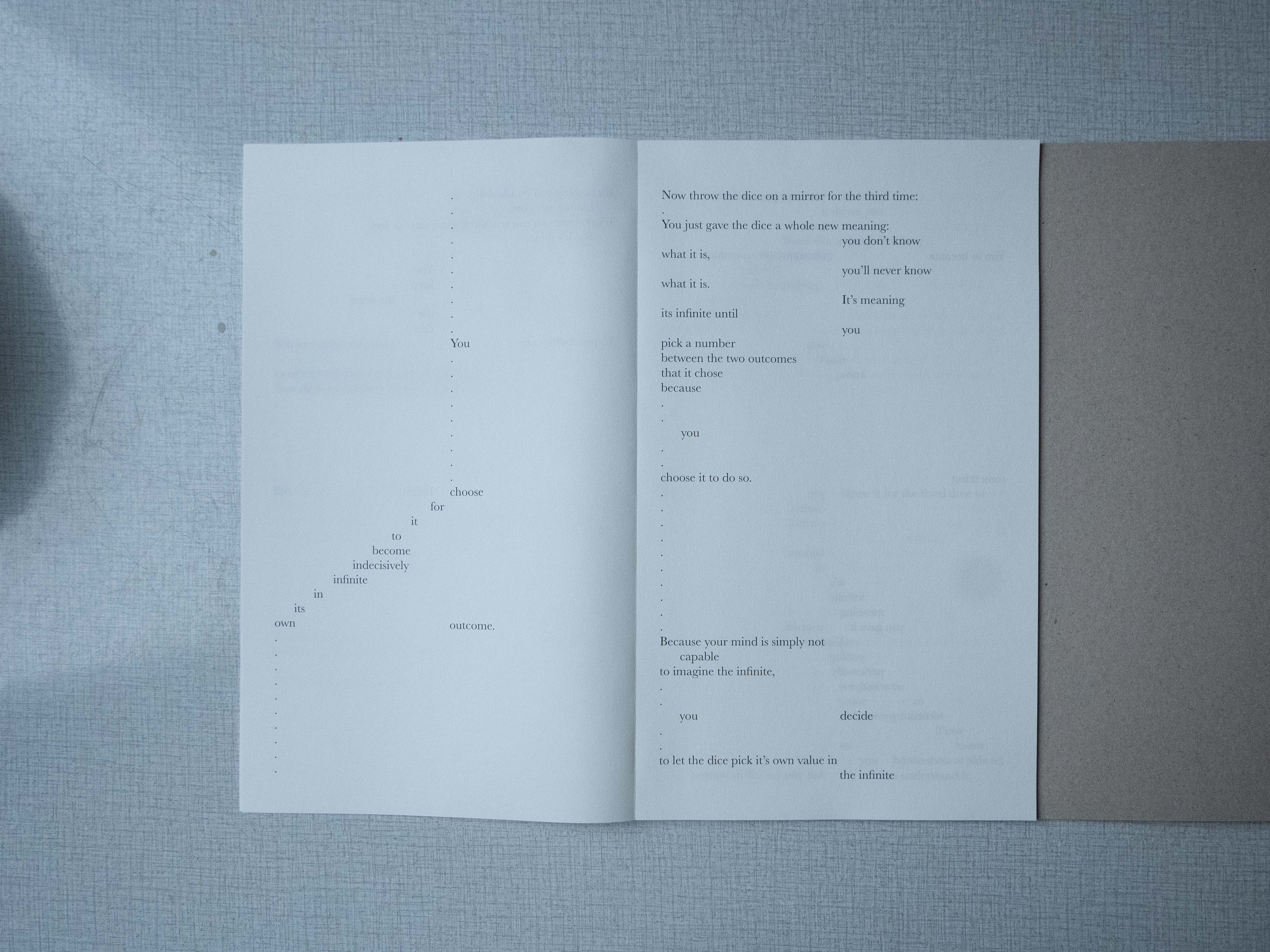


Throwing a dice on a mirror (2019)
Game/ manifesto
330 x 330 mm,
Interior: Laser print, Papyrus 120g/m2,
Glass Mirror (300 x 300 mm)
Hand painted cartboard, acrylics
Cover: Hand painted cartboard, acrylics
Binding: Cold glue
set in Georgia
Game/ manifesto
330 x 330 mm,
Interior: Laser print, Papyrus 120g/m2,
Glass Mirror (300 x 300 mm)
Hand painted cartboard, acrylics
Cover: Hand painted cartboard, acrylics
Binding: Cold glue
set in Georgia
.
( 301014 101018 (2018) )
Publication
Publication
A small collection of texts and scans from a notebook.


301014 101018 (2018)
publication
148 x 210 mm,
in/ex- terior: laser print,
Recystar 120 g/m2, Cromatico transwhite 110 g/m2
Stapled
.
.